
Farthest Frontiers on Earth (Figma)
Desktop Version
For this website, I aim for it to serve as an informational and conceptual platform. The target audience includes individuals who love to travel and learn more about the world. These users may search for travel destinations, visit the site, gather information, and ultimately decide to travel to those places. Therefore, I believe a simple, clear design with ample visuals and informative content will best meet these objectives. Considering that visitors might access the site more frequently, I assume they will prefer a desktop version, as it offers a better experience for reading text and watching videos on larger screens.
For the desktop prototype, I fixed several icons—such as "next page," "audio," and the top bar—so they remain visible while scrolling. This ensures users can pause the audio, navigate to the next page, or return to the menu at any time. Additionally, to avoid confusion between the next page icon and the next video icon, I placed the next page icon in the bottom corner.
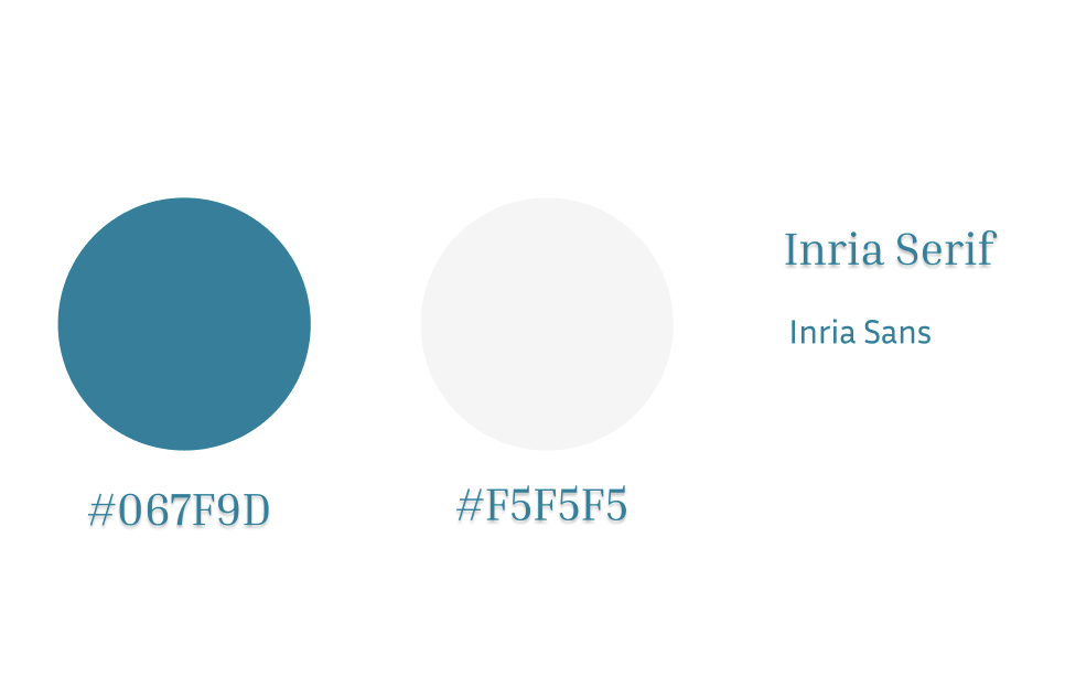
In terms of visual design, I aim to create a calm, clean, and clear aesthetic. To achieve this, I chose a limited color palette with two low-saturation tones. For typography, I selected a formal font style to align with the site’s informational purpose, blending both serif and sans-serif fonts for variety.
Mobile Version
My goal for the interactive features is for them to be direct and easy to use. In the mobile prototype, I used a swipe gesture to navigate between pages, as this aligns better with typical phone usage than clicking. I positioned the audio icon in the top right corner, making it easily accessible when holding the phone with one hand. Instead of using a traditional hamburger menu, which can obscure information and may be difficult to see on small screens, I created a menu page that covers the entire screen.
Project information
- Category Web design
- Software Figma
- Project date September, 2024
- Project URL
- Visit Website